
Kiip is an in-app mobile advertising platform that uses "moments" to create meaningful customer interactions through in-app customer rewards. An example of this would be, completing all your to-do's in Any.do and then winning a bag of Sour Patch Kids or a free coffee for it. At the time, most of our our ad business came from huge companies like McDonalds or Mondelēz (they own Oreo and Sour Patch Kids). These large accounts were handled personally by account managers with the responsibility of making the ad clients happy, as well as coordinating and creating all of the campaigns on our campaign manager dashboard. The account managers would coordinate with the agency or in-house teams to collect all the necessary assets to create and manage the ad campaign. This took lots and lots of people hours.
Because the process was so people-intensive, we were missing business from small- and medium-sized companies that wanted to spend money but “weren’t worth the account managers' time” from a business perspective. We saw an opportunity for revenue growth.
For this project, I partnered with Kevin, our VP of Growth acting as a PM, and our backend and frontend engineering teams. Generally, Kevin would come to me with a proposal, then we’d do research, get sign-off from the CTO, then start building. We knew we wanted to get something out there quickly and iterate based on customer feedback. This was also a great opportunity to fold some of the branding I’d developed back into the dashboard side of the house.
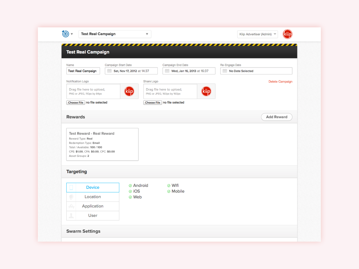
Here’s what the dashboard for account managers looks like. It’s very compact and optimized for a person that has been taught how to use it.
We knew that our customers may not know the ad targeting lingo, so we’d have to be as verbose as possible. This page is very busy, so we wanted to give only one task to complete at a time. There was also no preview of what anything would look like. Many times account managers would mock-up previews in Keynote presentations and send them over to the large clients. From a technical perspective, we knew that we’d have to re-use many of these UI elements if we wanted to launch quickly.
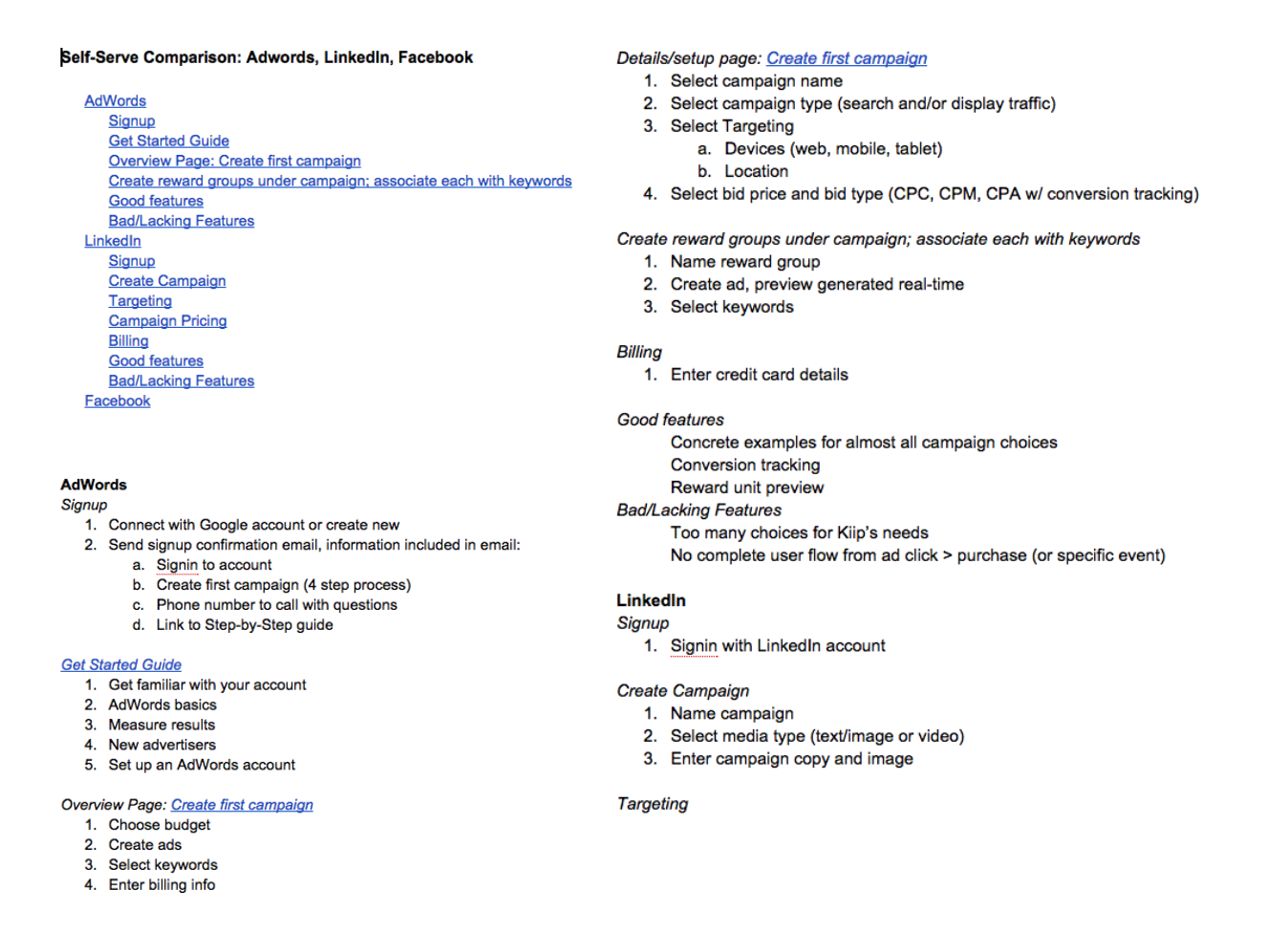
For research we did an intense competitive analysis of the best self-serve ad creators. At smaller, scrappier startups, sometimes you rely on the research teams of larger companies to help you along the way ;). At the time, the self-serve industry leaders were: AdWords, Facebook, and LinkedIn. We mapped out each company’s flow and analyzed them to find the best way to map out our step-by-step flow.
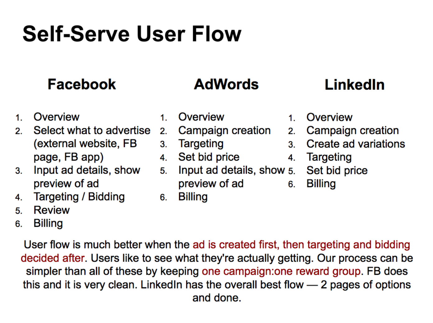
We noticed a few similarities between the industry leaders. All flows began with an overview to help customers understand what they’d need to complete the entire process ahead of time. Nobody wanted the customer to abandon the campaign creation process midway because of a missing asset. We also noticed that all three followed generally the same flow. We wanted to minimize steps, but also isolate tasks so that customers wouldn’t get overwhelmed by the process. We planned to start with the creatives and then get into targeting and payment options.
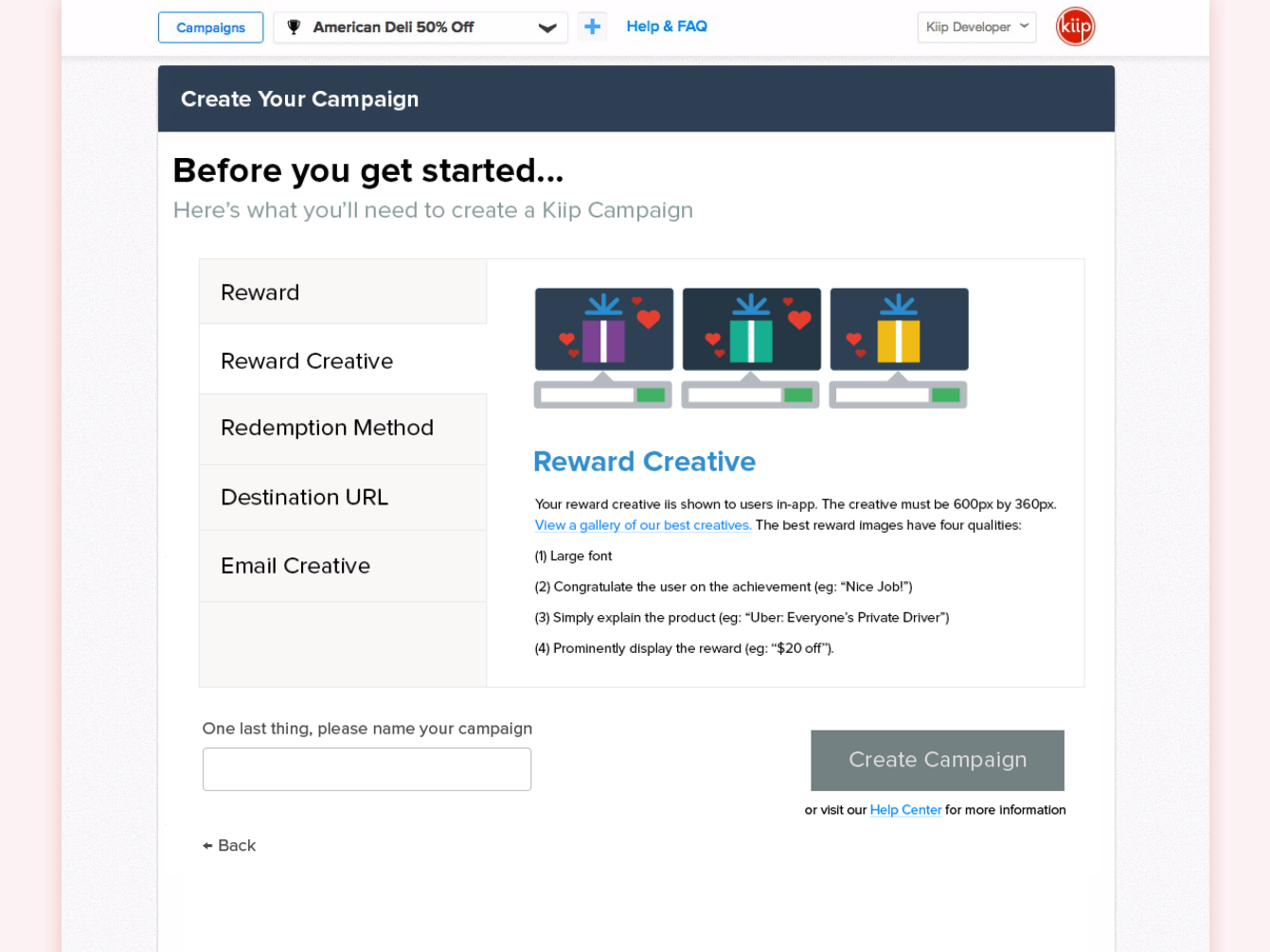
We started with the overview of everything you'll need to create the campaign. We put the required items in large plain text on the left-hand side. We also added short best-practices to help our customers create successful ad campaigns and build trust. Lastly, we wanted our customers to name their campaign to form a feeling of attachment.
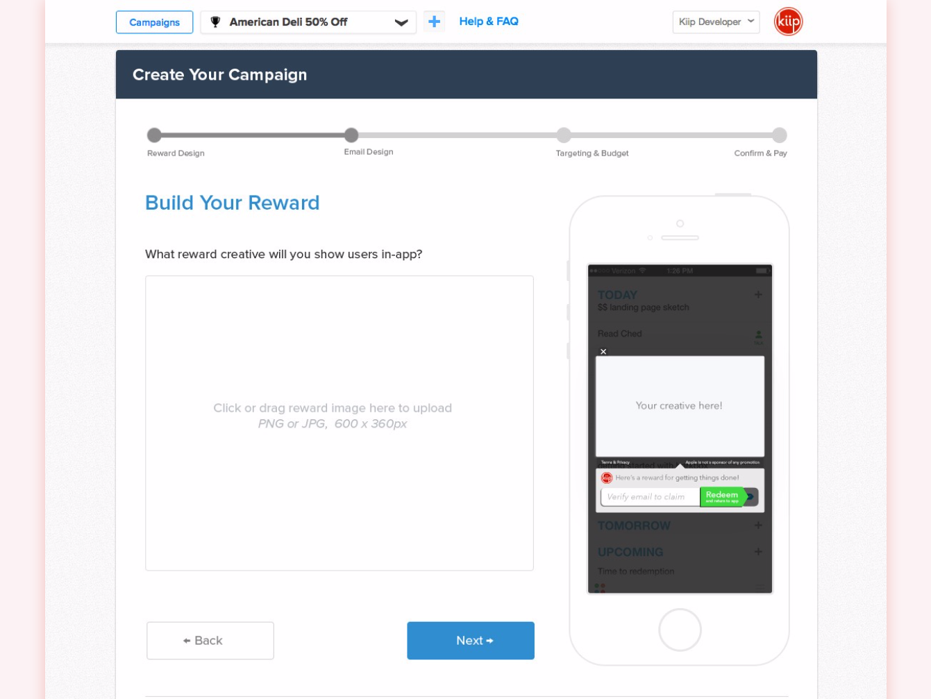
The first step is building the ad that people would see on their phones. Customers could click or drag a reward creative onto the page to have it preview in the phone mock-up on the right. It was super important to show our customers what people would see in the wild.
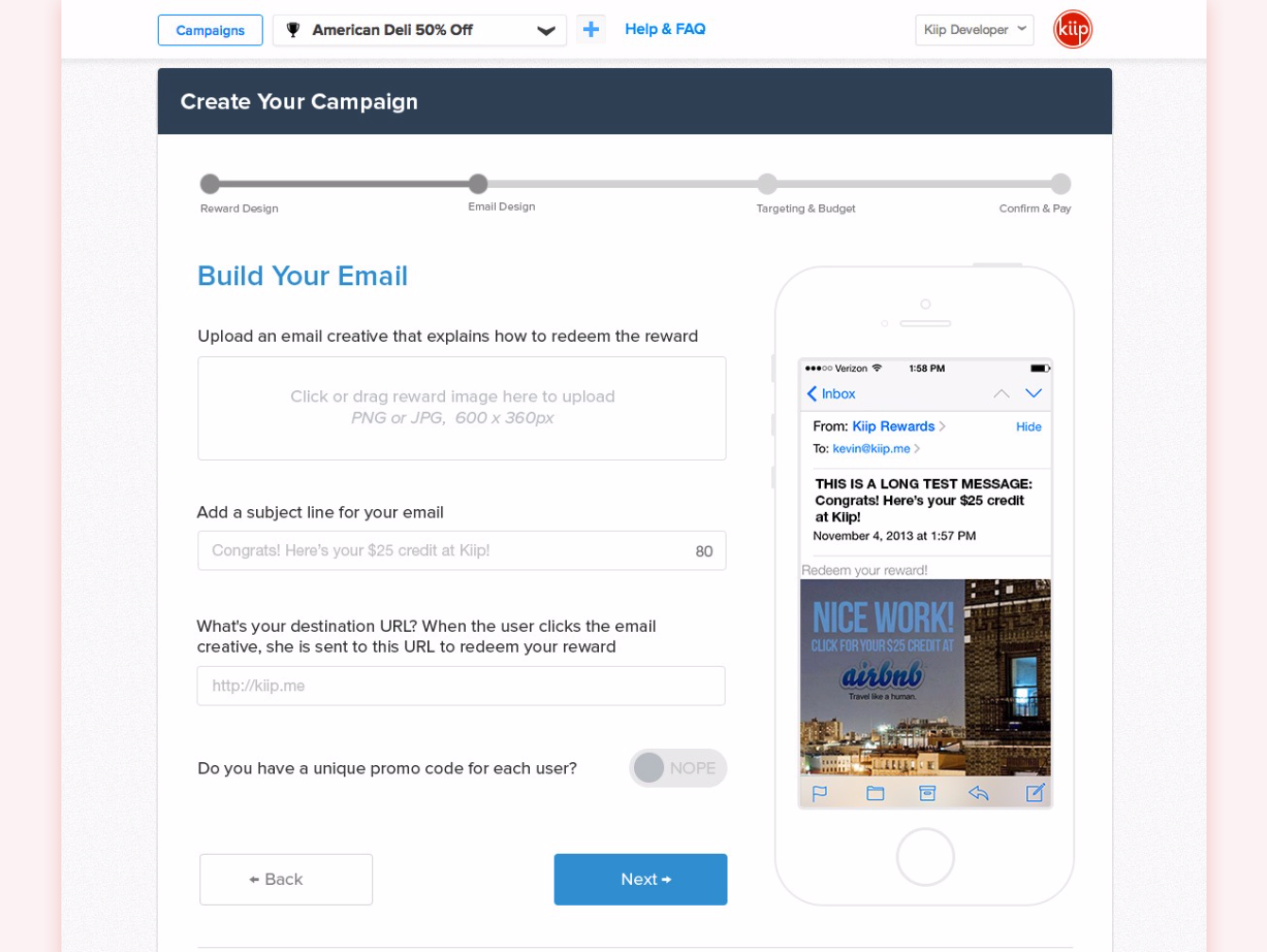
After building the in-app reward, next we would create the email so that customers could confirm and redeem their reward. This email would need to describe how to redeem the reward they had won. Again, we wanted to show what people would be getting in their inbox. The subject line and reward creative would preview based on the input in the form fields to the left.
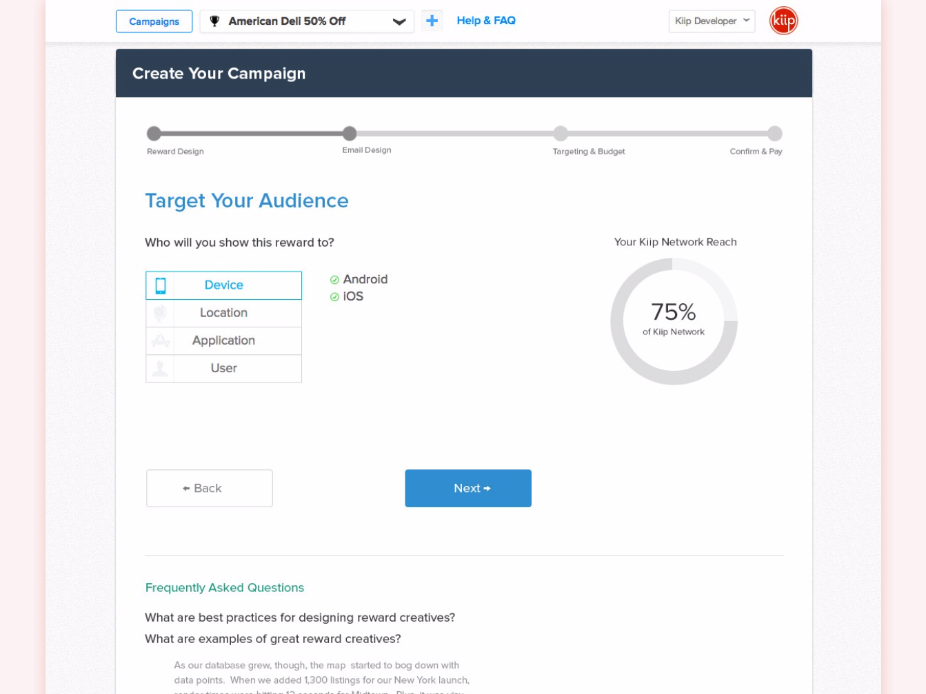
Now we get into the business side of things. We reused our targeting UI from our original campaign form. Customers could click on any of the 4 tabs to the left and the graph on the right would update according to the targeting selections.
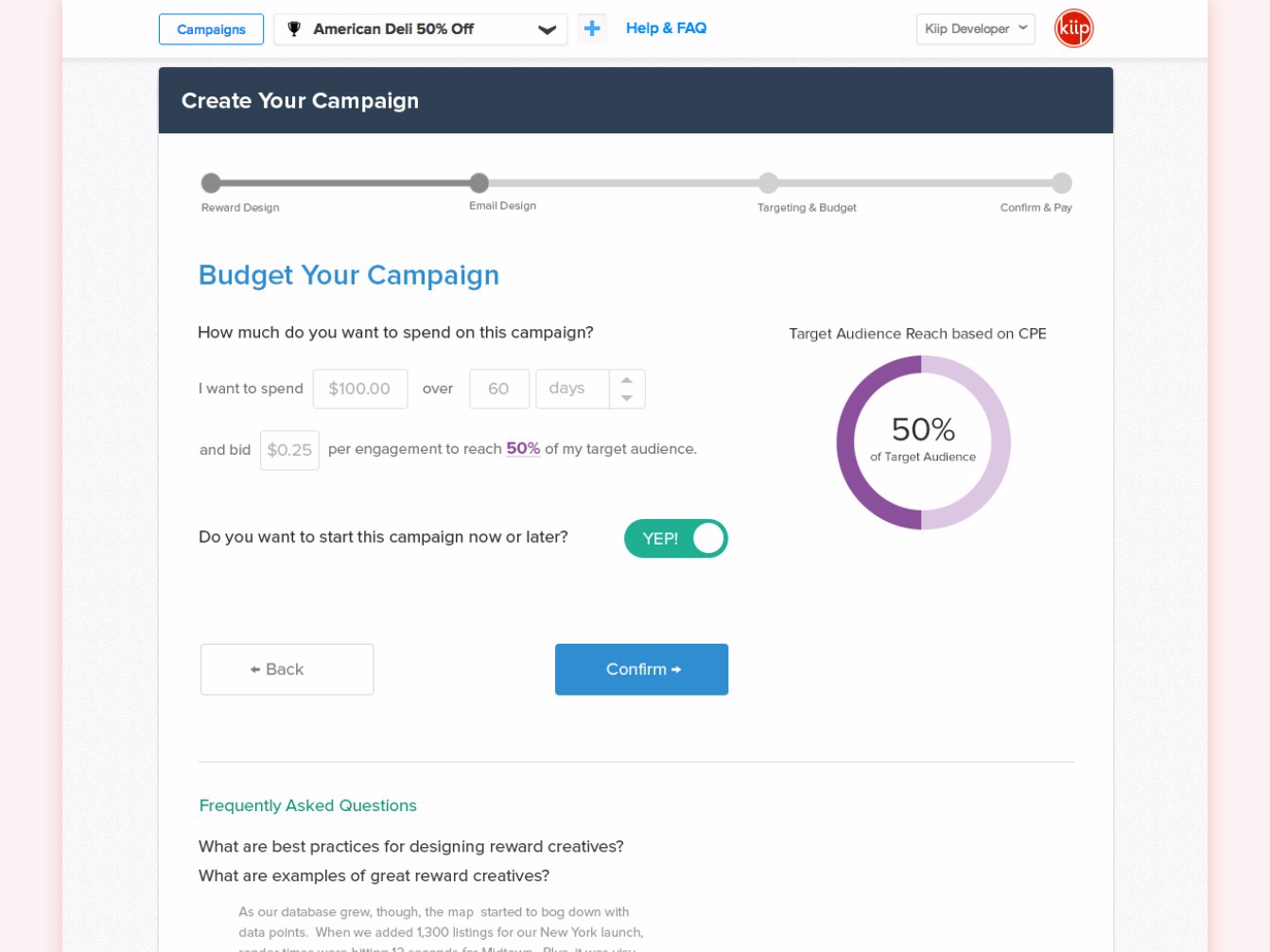
With budgeting, we wanted to make it as plain-language as possible, so we went with a mad-libs approach. With bidding, we wanted to have the customer play with the numbers to understand that they more you bid, the more of your target audience you would reach.
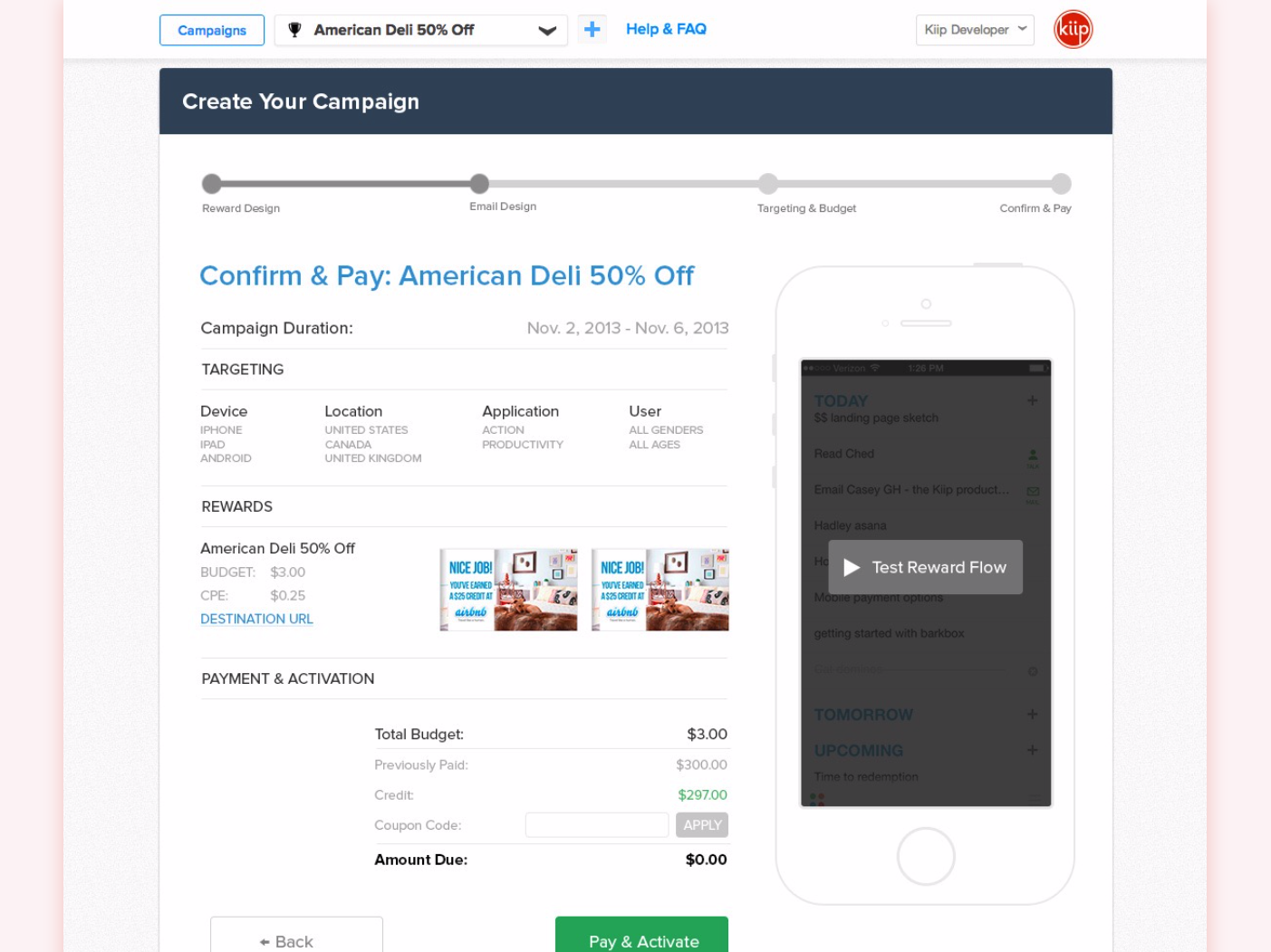
After targeting and budget, you're sent to the campaign confirmation screen. This where you can see your whole campaign at a high level and see one last preview on the right to make sure everything's correct. Once you click the green Pay & Activate button, you're done.
We onboarded a few small and medium businesses to test the feature, guiding them through the process to learn where our hiccups were. We were able to quickly iterate based on their feedback, often making changes within the week. Within 12 months of launching the self-serve platform, it was generating 30% of company revenue and became a multi-million dollar business unit.