
Wiith is a consumer social app on iOS and Android that serves small friend groups via chat and a shared canvas. Group participants can chat in a traditional linear chat format or use the canvas to share images, GIFs, and drawings. If two or more people were in a canvas together at the same time you could watch the other people manipulate the canvas in real time.
When I joined the core chat and canvas functionality had been built, and the team was focused on finding product market fit. Our company philosophy was to try lots of new things to see what resonates with people then refine. The team had decided to pivot the target audience from Gen Z to a cozy gamer demographic. The company was small and mighty at 19 total employees. The design team was composed of the VP of Design, Andy, and myself.
Feature goals:
- Give users a highly customizable rich building experience akin to popular cozy games like The Sims or Animal Crossing
- Lets users have multiple spaces/rooms on their profile
- Gives users an async single-player experience
Viewing profiles
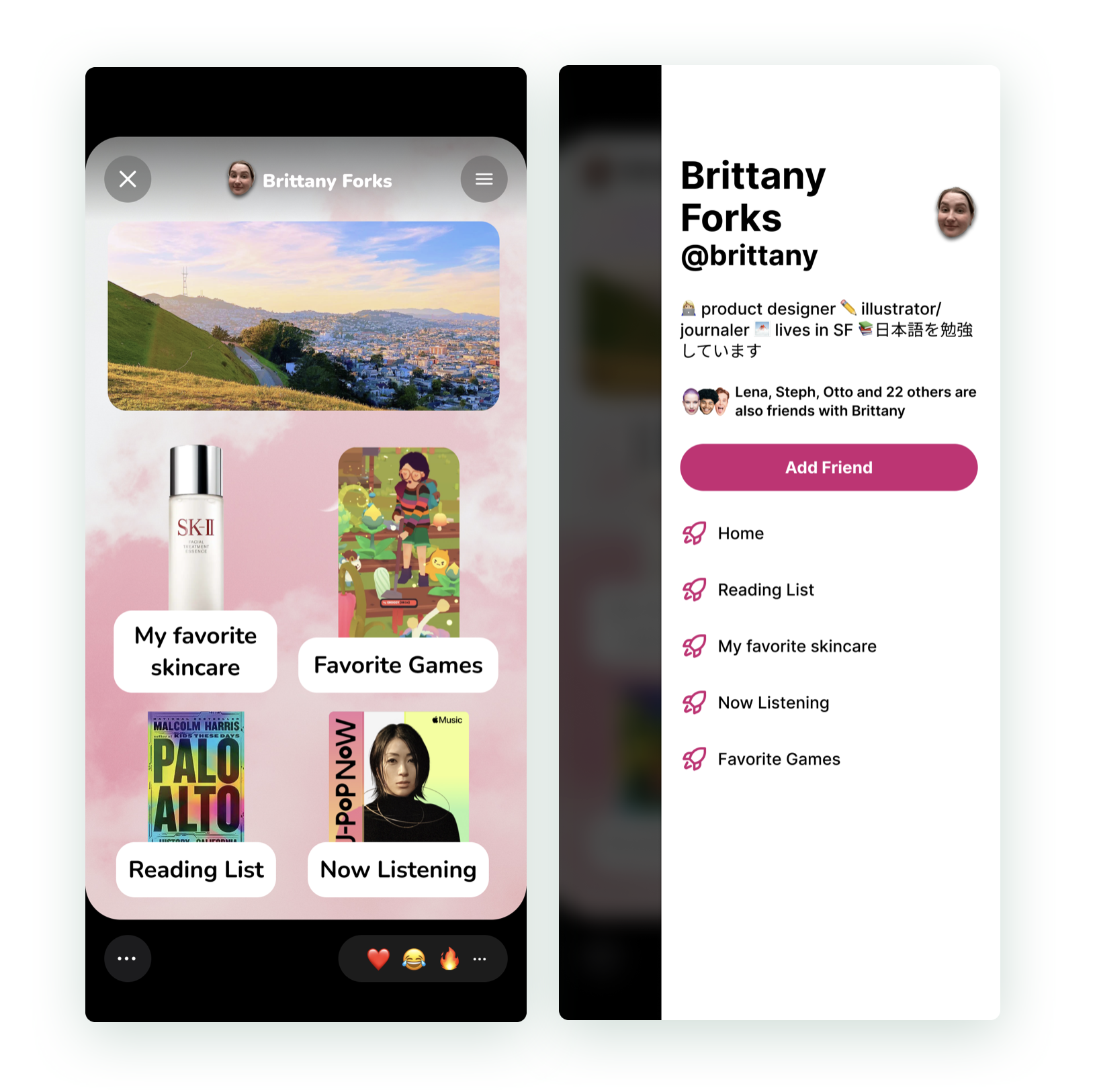
On the top is a video of a real profile made on Wiith.
Each profile opens up as a self-contained full-page modal with it’s own navigation independent from the rest of the app. Every user has a “home” profile page by default, and can add as many additional profile pages as they wish. You can navigate to these additional pages and the user’s bio via the hamburger menu on the top right of the canvas or via in-canvas links if the profile maker has set them up. You close the entire profile by tapping on the X on the top left of the canvas.
On the bottom left, in the overflow menu you can unfriend, block or report the user. On the bottom right you can react to the user’s profile with an emoji.
Viewing your own profile
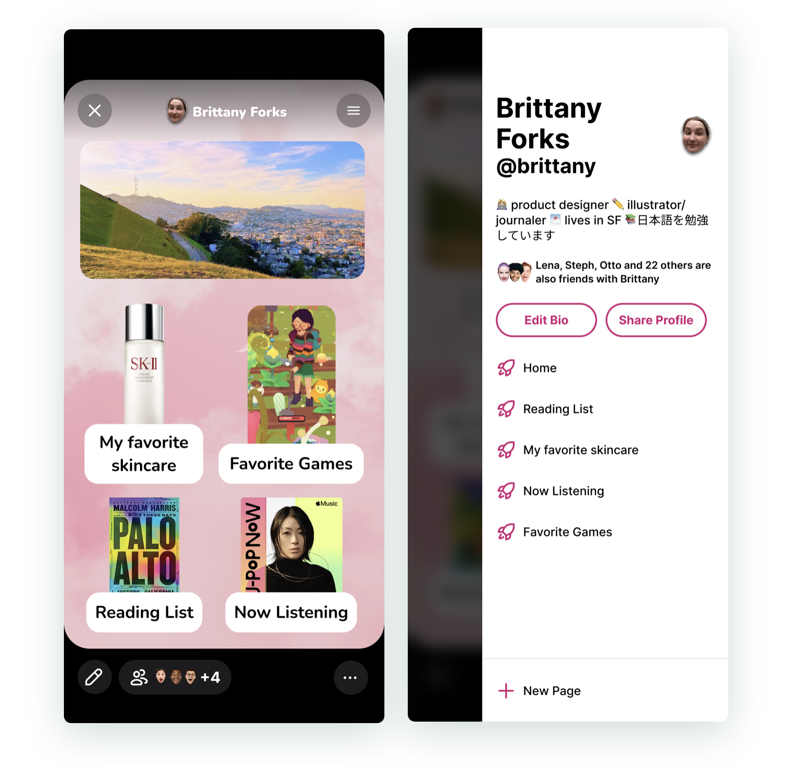
The profile is still it’s own self contained modal. The bottom UI and drawer UI is a little different when you’re viewing your own profile. The bottom UI contains an edit button, a button to see everyone that viewed and/or reacted to your profile and the overflow where you can save or share your profile.
In the drawer the options are a little different where you can edit your bio information and profile accent color, another CTA to share your profile, and an option to make a new page for your profile.
Editing profile pages
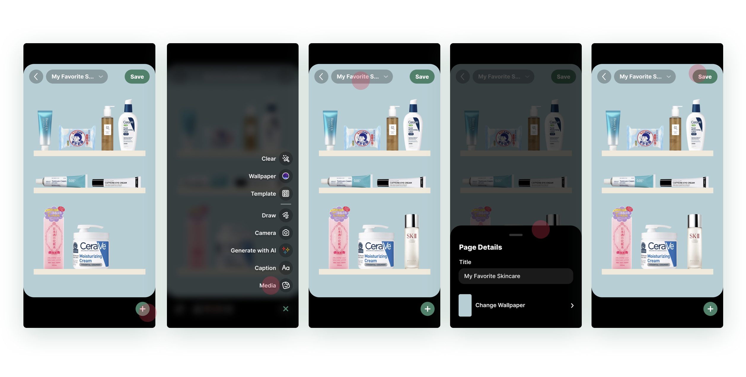
Since profiles were a collection of canvases, we reused all of our canvas editing tools from chat. That’s the green plus sign and attached fly-out menu.
You can edit any of your pages by navigating to the page and then hitting the little edit pencil in the lower left. In the mock above I have an empty space on my bottom shelf. I open the fly out menu, and tap the media option, from there I choose my SK-II image from my camera roll and place it on the shelf. If I wanted to change the name of my page, I can tap the page’s name on top and a bottom sheet appears where I can rename the page or change the background. Once I dismiss the bottom sheet I can tap the save button in the top right and “publish” my page.
Links
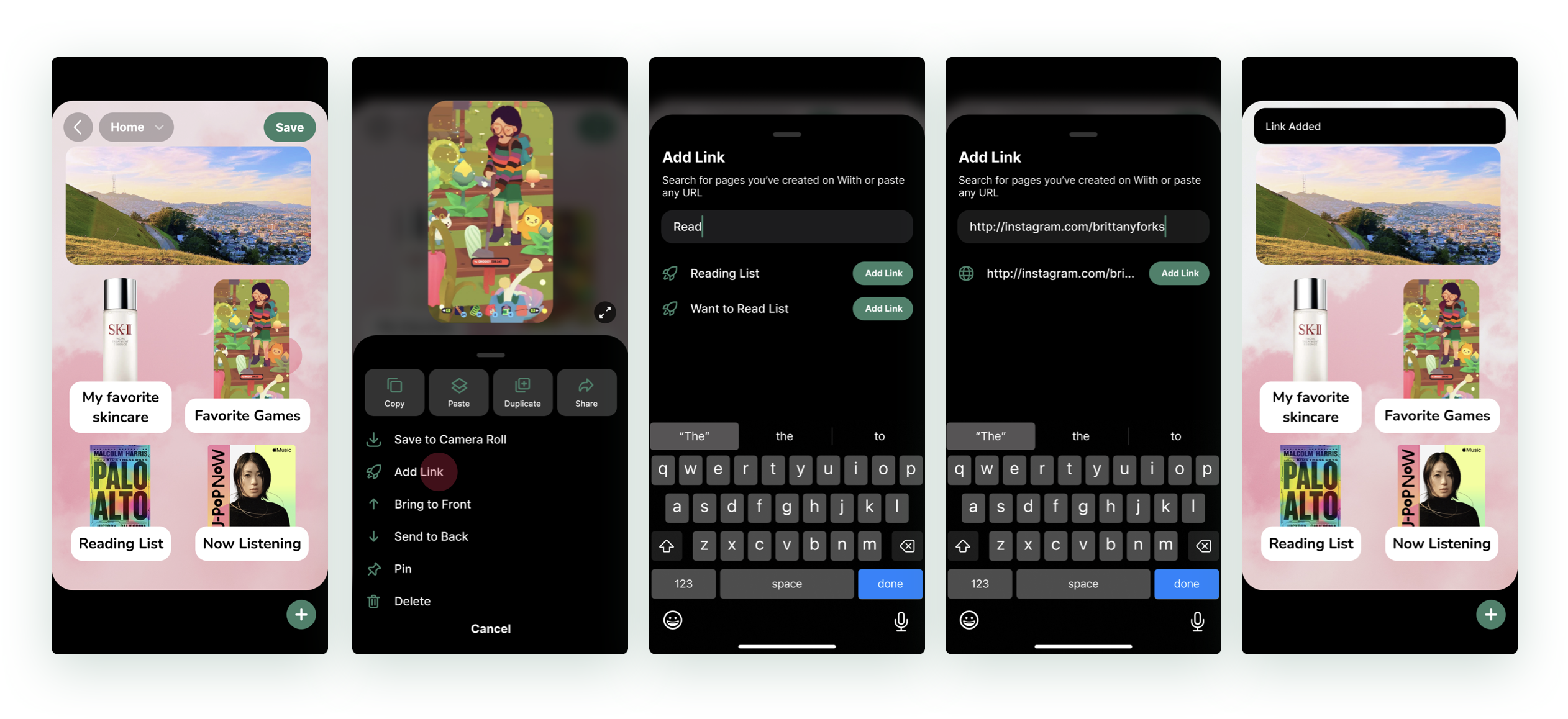
In addition to being able to navigate to pages from the side drawer we also wanted people to have flexibility to add links within the canvas.
Users could link any object on the canvas to another profile page or an external link to the web. When you tap on a linked item, a small toast pops up to invite you to navigate away from the page. We added in this speed bump to avoid any unexpected jumps and giving you full transparency on where you’re going by showing the URL.
Adding links
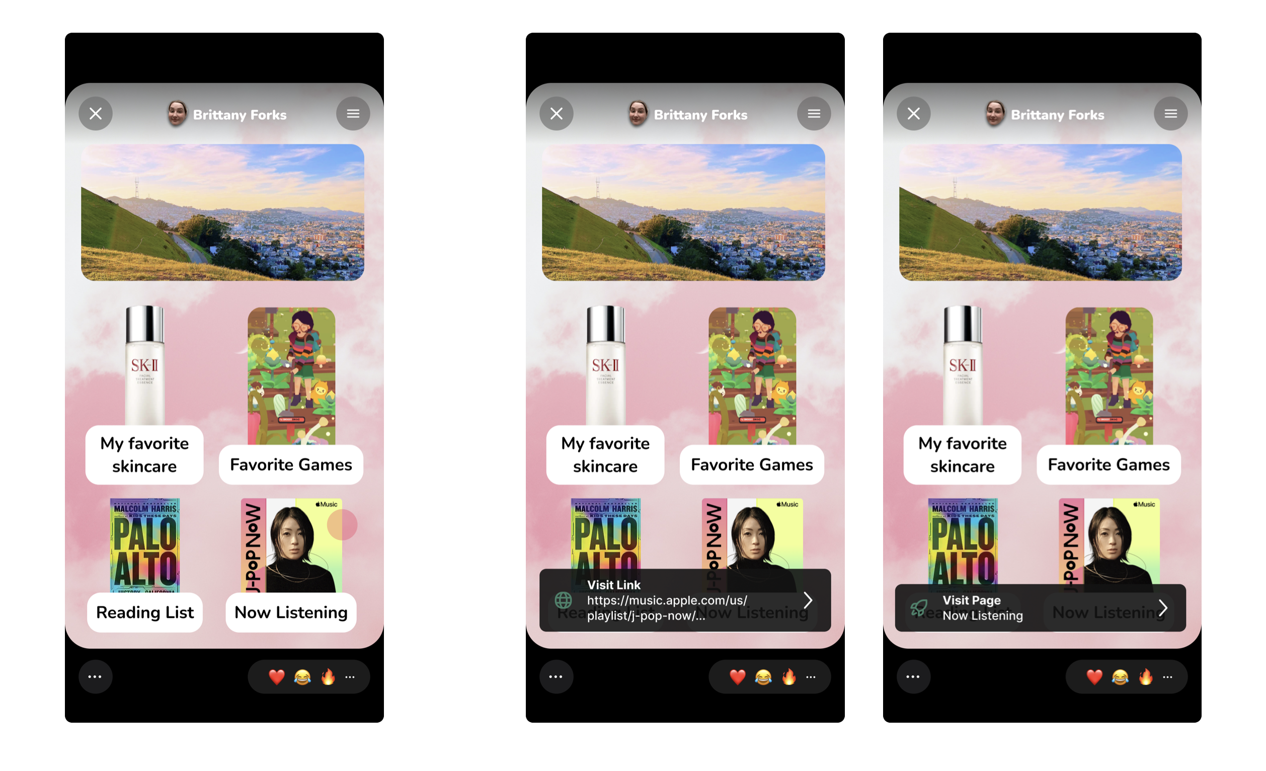
To add a link, you begin by editing one of your pages and long pressing on any item on the canvas. That will bring up a bottom sheet menu, tap add link, then search for your page or paste in your URL. Tap add link and you’ll get a confirmation toast.
Updated app color palette
In service of the UI work on this project, I also created a palette of accent colors which we folded back into our design system for app wide use. The colors are at least AAA compliant with both white and black text. Most are AA compliant.